Colour is more than just a visual element in web design – it’s a powerful tool that can influence user experience and brand perception. Choosing the right colour scheme and understanding how colours work online can help you create a website that is not only visually appealing but also effective in communicating your brand message.
So, what do you need to know about colour when you’re building a website?
Read our guide on how to get content right for a website.
Understanding colour systems in web design
In web design, selecting the right colours is crucial for creating a visually appealing user experience. Different colour systems, each with its unique application, play a role in ensuring that colours are displayed accurately and consistently.
For example, Hex codes and RGB colours are directly used in web design, providing the tools needed to manage colours on digital platforms. Pantone and CMYK are more relevant to print – but knowing about these can help you create visual consistency across your marketing platforms.
Understanding the following systems is important for creating a cohesive brand experience online (and offline).
Hex codes
Hexadecimal codes are a staple in web design, used to specify colours in HTML and CSS. These six-digit codes, such as #FFFFFF for white, ensure that colours are rendered consistently across different browsers and devices. Hex codes are essential for defining precise colours in web design, helping maintain a cohesive look across digital platforms.
Learn more about hex codes.
RGB (red, green, blue)
The RGB colour model is foundational in web design and digital media. It uses varying intensities of red, green, and blue light to create a broad spectrum of colours. RGB is ideal for screen-based media, allowing designers to craft vibrant visuals that look great on any digital device. This model is integral to creating and adjusting colours in digital graphics and web designs. RGBA extends the RGB model by adding an alpha channel to represent transparency. This allows designers to apply transparency effects to elements on a webpage.
HSL (hue, saturation, lightness)
HSL offers a more intuitive way to work with colours by specifying hue (the type of colour), saturation (the intensity), and lightness (the brightness). This model is particularly useful in CSS for dynamically adjusting colours, enabling designers to easily tweak variations by altering saturation or lightness. The HSLA variant includes an alpha channel for transparency.
Pantone
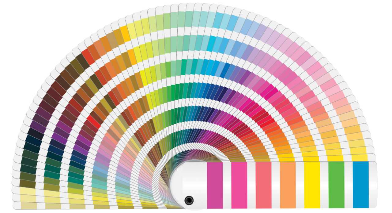
While not directly used in web design, Pantone is crucial for branding and ensuring colour consistency between digital and print materials. Designers might reference Pantone colours to align web graphics with printed items like business cards and packaging, maintaining a consistent brand identity across different media.
Learn more about the Pantone colour system.
CMYK (Cyan, magenta, yellow, key/black)
CMYK is primarily used for print design rather than web design. It combines four ink colours to produce a full spectrum on paper. Understanding CMYK is important for designers who need to ensure that printed materials, such as brochures or flyers, match the colours seen on digital screens.
 Which colours work best on websites?
Choosing the right colours can make or break your website’s design. Ultimately the colour that will work best on your website is dependent on lots of factors, including:
- Your target audience – You could tailor your colours to the preferences of your audience’s lifestyle and interests to boost its appeal.
- Psychological impact – You might use colours to evoke desired emotions, aligning with your brand message.
- Accessibility – Think about creating a contrast between text and background for readability and consider colourblind-friendly palettes.
- Competitor analysis – Consider differentiating your brand by choosing distinct colours or aligning with industry standards to meet expectations.
- User experience – Think about using colours strategically to guide user interaction and highlight important elements like buttons.
- Trends – stay aware of design trends and think about balancing them with timeless choices for long-term relevance.
Here are a few popular choices and why they work:
Blue – This colour is generally considered trusted and reliable, making it a favourite for financial and tech companies like PayPal. Blue is calming and professional, which helps establish trust with users right off the bat. It’s a versatile colour that works for everything from call-to-action buttons to background elements.
Green – Often associated with growth and harmony, green might be used by companies that want to convey a sense of renewal and balance. Spotify uses green to reflect its innovative and creative brand ethos. Green might be used to highlight eco-friendly initiatives or products, reinforcing a brand’s commitment to sustainability.
Red – Known for its ability to grab attention and convey urgency, red is a dynamic choice. It’s used effectively by YouTube to encourage users to engage with content. Red might be strategically used to draw attention to important information or prompts, guiding user interaction.
While these colours are popular, breaking the mould works too. Unique colour schemes can make your brand stand out. Dropbox, for instance, uses a minimalist palette that differentiates it from competitors. Just ensure that your choices are in line with your brand and boost usability rather than detract from it.
Read our guide on how to optimise images for SEO.
 Why is colour consistency important for your website?
Remember, consistency in colour use across your website can be key to building a strong brand identity. It helps users recognise your brand instantly and fosters trust.
When users repeatedly encounter the same colours, they start associating those colours with your brand. Coca-Cola is a classic example, using its iconic red to maintain a consistent brand image across all platforms. This helps to create a sense of familiarity and loyalty among customers.
A consistent colour scheme also makes your website look polished and cohesive. IBM uses a steady palette of blues to project professionalism and trustworthiness, reinforcing its brand as a leader in technology. Consistency in colour also reflects attention to detail, which is good for your brand’s perceived quality.
Colour consistency helps navigation and enhances the user experience too, as it helps users intuitively understand how to interact with your site. Slack does this well by using its signature purple throughout, making the platform easy to navigate and instantly recognisable. This strategic use of colour can also highlight key areas and guide users seamlessly through your content.
Learn how content marketing attracts traffic to websites.
How do I create a colour palette for my website?
Creating a colour palette involves more than just picking colours that look good together. It’s about choosing colours that reflect your brand’s values and resonate with your audience.
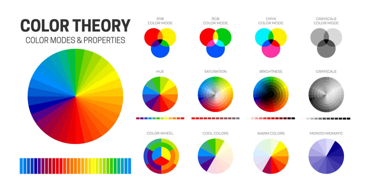
You could start by looking at a colour wheel and thinking about the following:
Complementary colours
These are opposite each other on the colour wheel and create a vibrant look. BuzzFeed uses complementary colours to make its content visually engaging and lively. This approach can be used to highlight important elements and create visual interest.
Analogous colours
These sit next to each other on the colour wheel and make for a harmonious feel. For example, Airbnb uses analogous colours to create a welcoming and warm user experience. This choice can help create a cohesive look and feel that aligns with the brand’s message.
Monochromatic colours
These involve variations of a single colour (not just black, grey and white) providing a clean and sophisticated look. Apple often uses monochromatic schemes to maintain a sleek and elegant design. This approach can simplify design choices and ensure a unified brand appearance.
When you’re thinking about developing your website’s colour palette, consider the emotions and messages you want to convey. Colour palette generator tools like Canva’s offering, or Adobe Color, can help you experiment with different combinations to find the perfect match for your site.
Ask for feedback from users for valuable insights into how your colour choices represent your website’s products or services and make sure they work with your brand identity.
Submerge can design and build your business a unique website that speaks to your customers and makes the most of your business offering.
Find out more about our website design services.
06/03/2026
The ultimate guide to image optimisation
Boost your website’s performance and rankings by optimising…
20/02/2026
30 content marketing statistics to shape your 2026 strategy
Explore 30 content marketing statistics for 2026 with…
21/11/2025
Social search: what it is and how to embrace it
Social media is rapidly changing how target customers…
01/11/2025
9 creative B2B marketing ideas to attract more customers
Don't fall into the trap of thinking your B2B marketing has…


